

Take a Break, a Section Break
Updating sections in "High Impact Documents" templates. Beta version 21st April 2024.


I read a lot of consulting decks. I get lost sometimes. Imagine working really hard on a report, a proposal, a business case and your boss saying “I just don’t get it…”
This happens a lot.
Structure is important. One important part of structure is signalling your structure with a good agenda / contents and Section Breaks to tell people where they are in your story. There’s a lot more to a good structure, but Section Breaks are a good start.
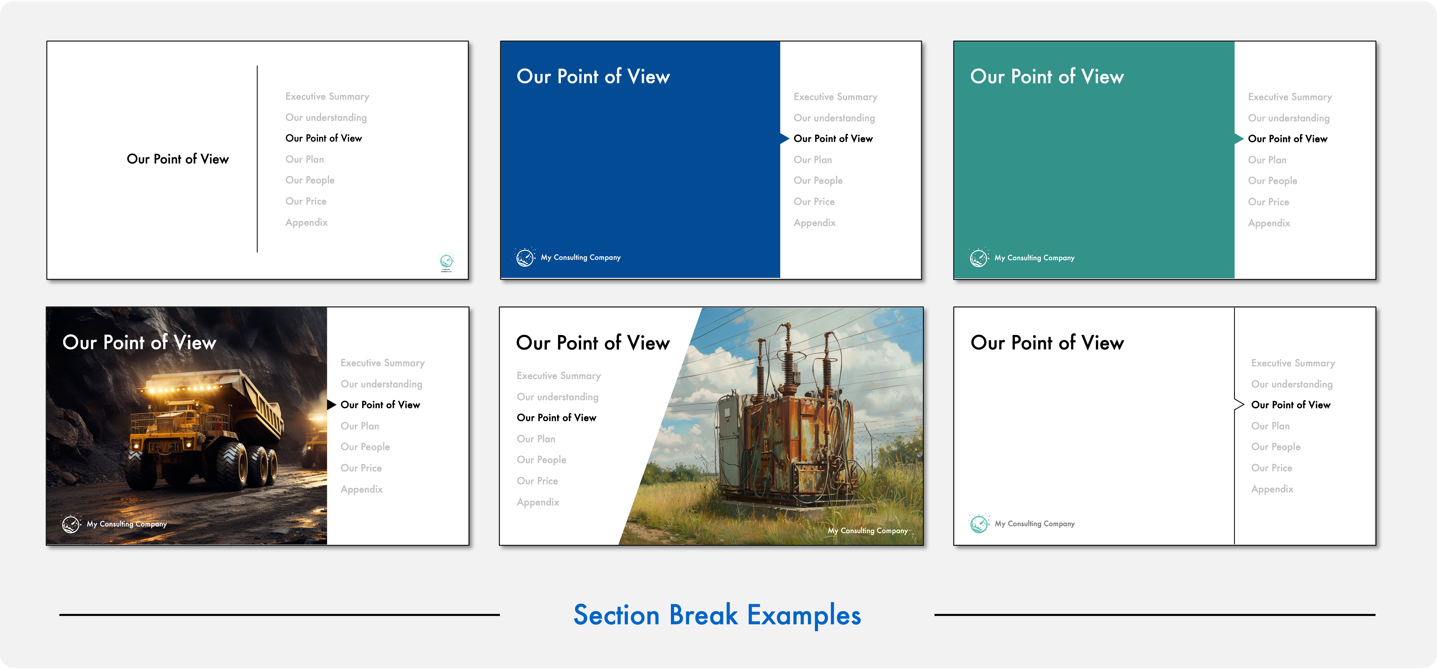
We use dividers or Section Breaks to create “chapters” in longer reports. Section Breaks aren’t exactly fun to talk about. But, there are good Section Breaks and bad Section Breaks. I like to use Section Breaks to help the audience understand my reports better. My tips are:
Section Breaks should visually stand out from the the rest of the report;
Section names should be unambiguous and set expectations; and
Section Breaks should show where you are in the agenda.
To illustrate lets look at a publicly available report. This example is a 95 page McKinsey report on the Future of Trash for New York City Sanitation. 95 pages is a long report, and needs a way of organising.
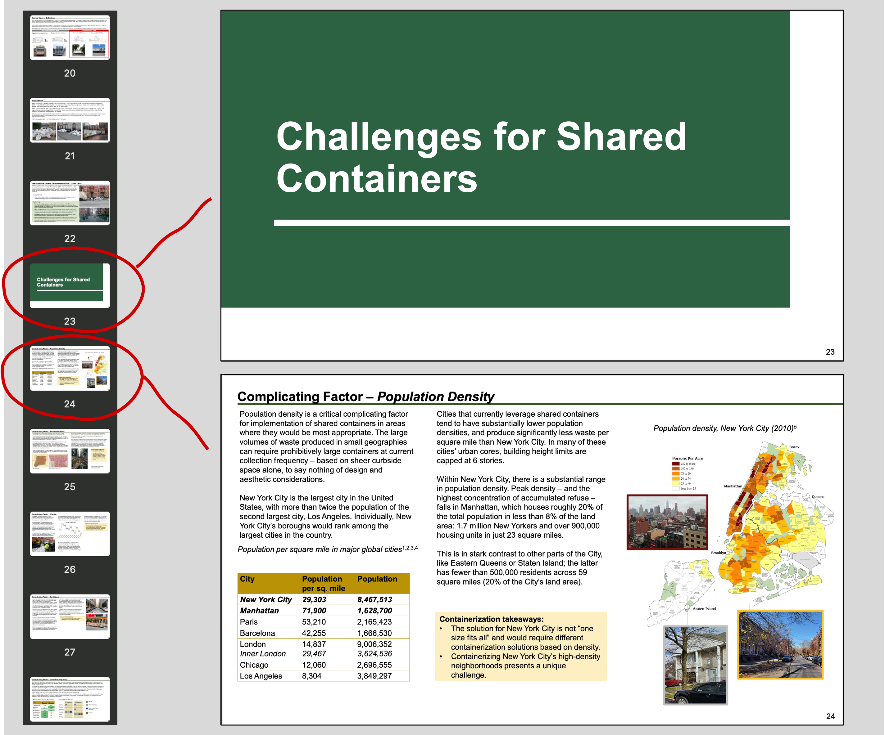
This report is dense with text and many pictures. How does it rate on three tips above?
Visually Stand Out: I like that the section breaks are visually different. The section break is a simple block green, not photos and minimal text. This contrast well against the other visually busy slides.
Unambiguous and set expectations: I like the “Challenges for Shared Containers” section break heading. However, I do wonder as a reader that the heading is very specific to “Shared Containers”. Are there not more challenges? Other vague titles like “Pathway to Containerization” do not help.
Show where you are in the agenda: This is a 95 page report. Showing where you are in the agenda would help the reader navigate.
Doing a quick make over of the section break slide results in:
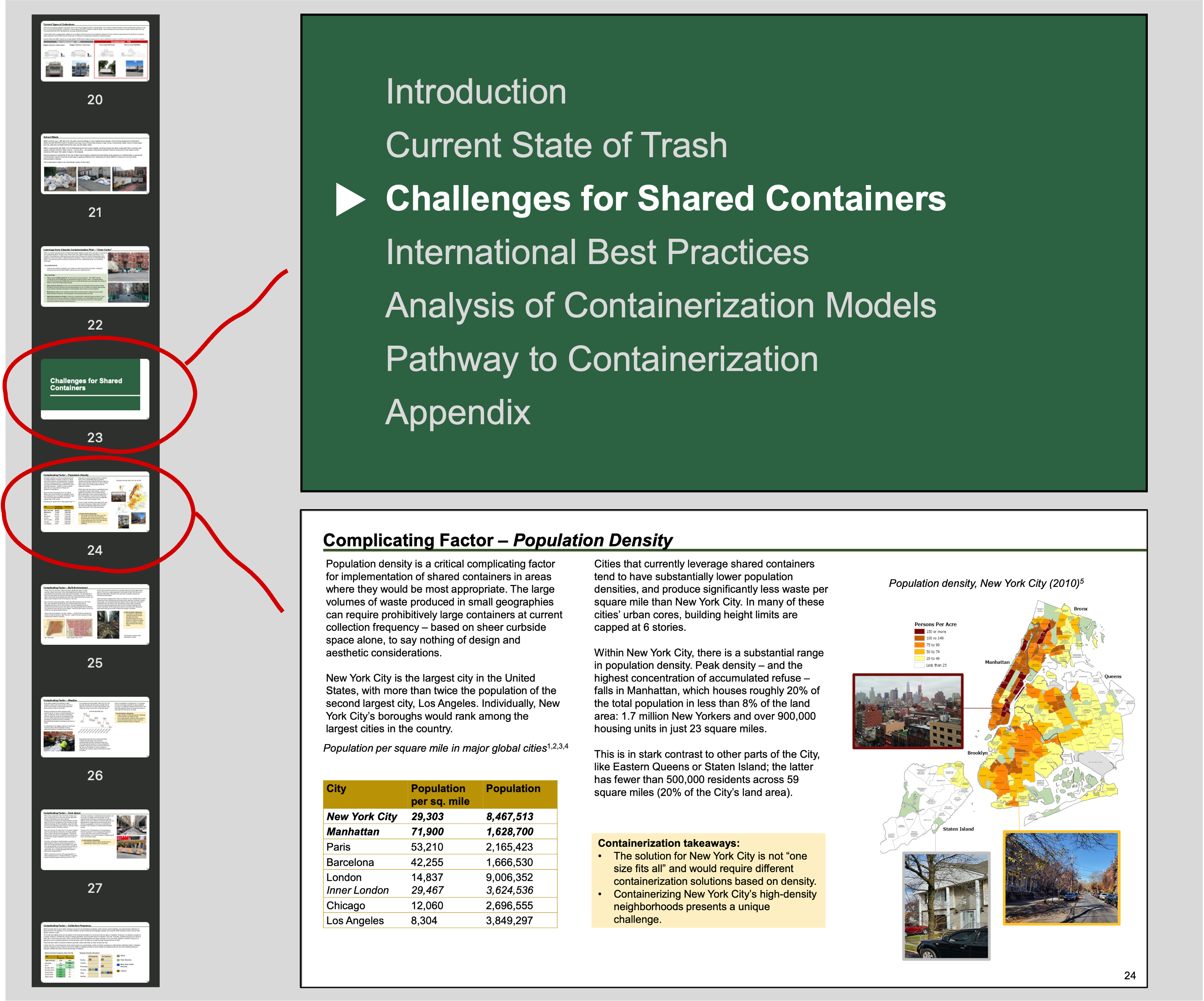
After the make over, this version still stands out from the rest of the report and puts the current section in context. This alows the reader to check “Ah here I am in the story”.
PLEASE NOTE: This report was created by the NYC Department of Sanitation with help from McKinsey. A full Oprah style make over would require more. I’d start with better headlines and more “so what?”.
There are other publicly available consulting report examples at Consulting Reddit Wiki. These examples .. are not exactly great and I don’t feel are representative of the best. However, they are examples, and they are available 😶
A similar list is at the Analysts Academy.
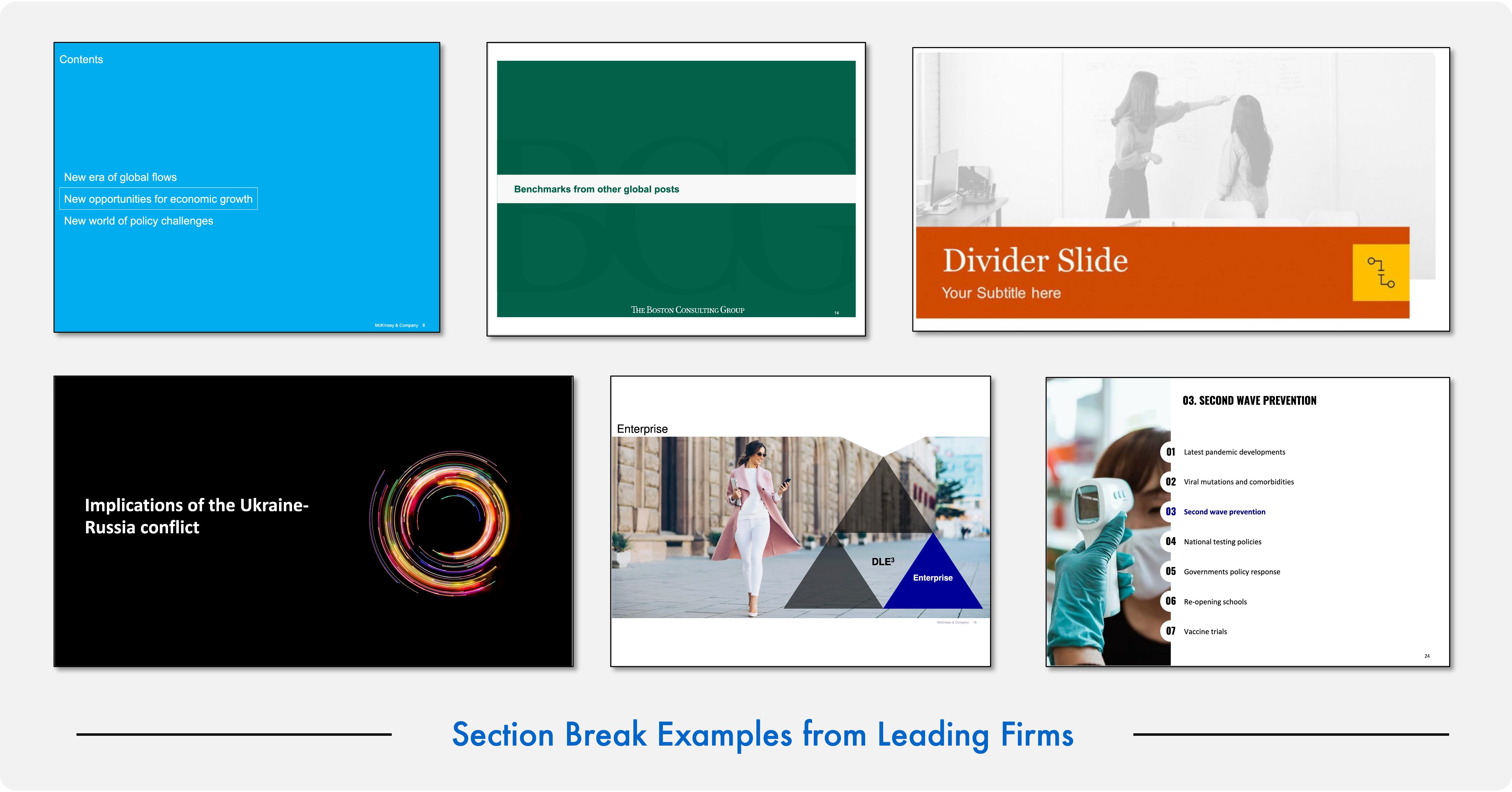
A quick scan of publicly available examples from McKinsey, BCG, PwC, Deloite and Oliver Wyman is below. You can see how things vary.
My personal belief is that once you’re heading to 10 pages I think you should have a few sections breaks. Why not make them better? Why not make it easier for the reader to track where you are?
What’s new in Business Template Deck : 21st April 2024
Not much this time. I’ve snuck in a few extra slides, plus a tidy up of the section on Section Breaks. I do prefer break slides that show where you are. I also prefer to use plain break slides if the report is fancy and full of pictures. Conversely if the report is plain with simple blocky charts and text, then I’d use breaks with fancy pictures. This is more my preference though.
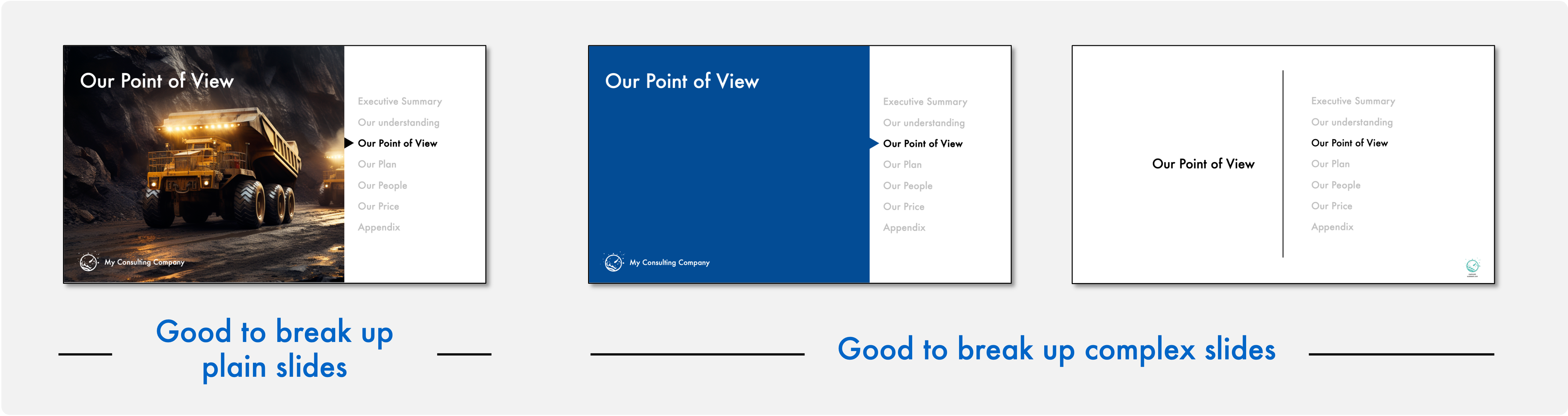
My go-to Section Break slide is the first slide below. Crisp and low ink. This stands out in complex decks. I also like using little arrows to help point out where you are, just in case the contrasting colour on the text doesn’t tell you.
If you want to move the arrow I recommend you select it with a click, then use your keyboard up or down arrow to move it. That way it will stay perfectly aligned.
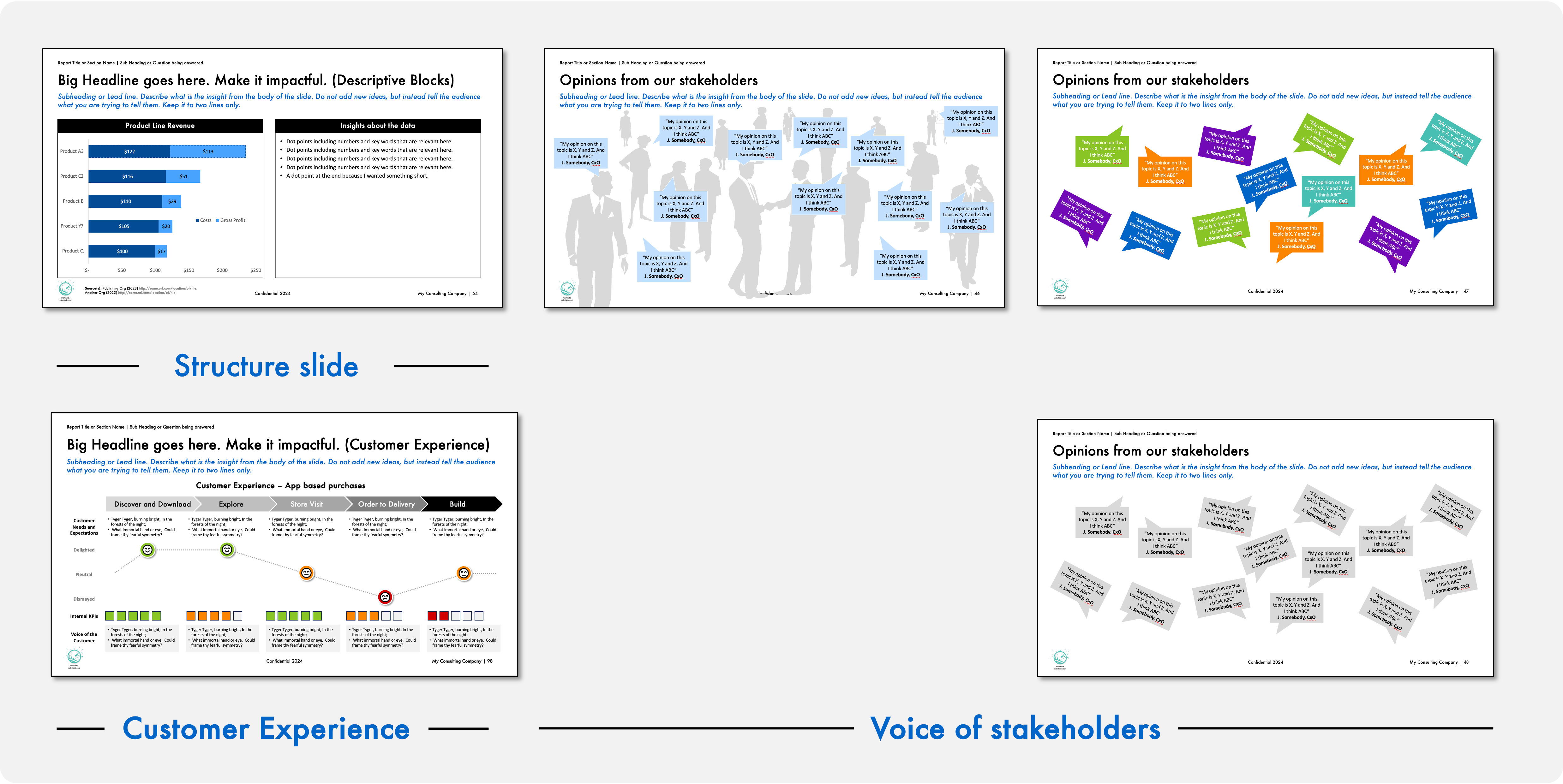
I’ve added a few slides I thought were missing in the deck. More Structure Slides for charts and text. Several Stakeholder Engagement slides, these are good to show the people you’ve engaged with and some of their (expressed) thoughts. Lastly another Customer Experience slide. I included this one as I’ve often seen CX and internal KPIs say different things. Sometimes it’s a lag and sometimes it’s completely at odds. This generates a good conversation.
Consulting Power Point Template - Free to download
Example slides like the above and a hundred more are available in my Free to use Business Template. My aim is to help new managers and consultants communicate better. Download, use it, and have fun writing.
Thanks for sharing the template! Out of curiosity, have you also tinkered with the AI powerpoint tools such as Gamma?
I'm thinking of writing a piece on the different tools in the powerpoint space and would love to get a perspective :)