


The Anatomy of a Slide: The Basics
Breakdown of how to make High Impact Documents for new consultants and managers. The first step to making impactful decks is to learn about the Anatomy of a Slide.


Getting good at slides is a dark art. It can mean the difference between getting $10 million of funding, or not. It can mean the difference between a promotion, or not. It can mean the difference between an interesting meeting, or a dull painful exercise which leaves your audience with a sour distasteful memory.
Getting good at slides is important in the corporate world. The first skill to master when making impactful slides is:
Be Consistent.
It sounds simple. But it is not. I read hundred page decks where each slide is a unique experiment. This makes me have to work hard read each and every page. This also makes me want to throw the deck in the bin.
Being consistent with your slides makes it easy for the reader to understand your message. It is a good idea to be consistent. You can do this by following a few rules:
Use the right template - use your firm’s template or guess what? I have a consulting template for you to use here. If you’re not sure which template to use in your office, just ask;
Do not move things around - this is an easy rule to say but hard to follow. The easiest way to make your deck look unprofessional is have the headings jump to different places each slide. Don’t; and
Stick to the constraints in the template - if your headline is “Ariel 32pts left aligned and one line” keep it like that.
What do I mean by constraints? and the “things” you shouldn’t move around? These “things” are what I like to call the Anatomy of a Slide. I’ll use this slide as an example.

The Anatomy of a Slide
The main components of a slide are:
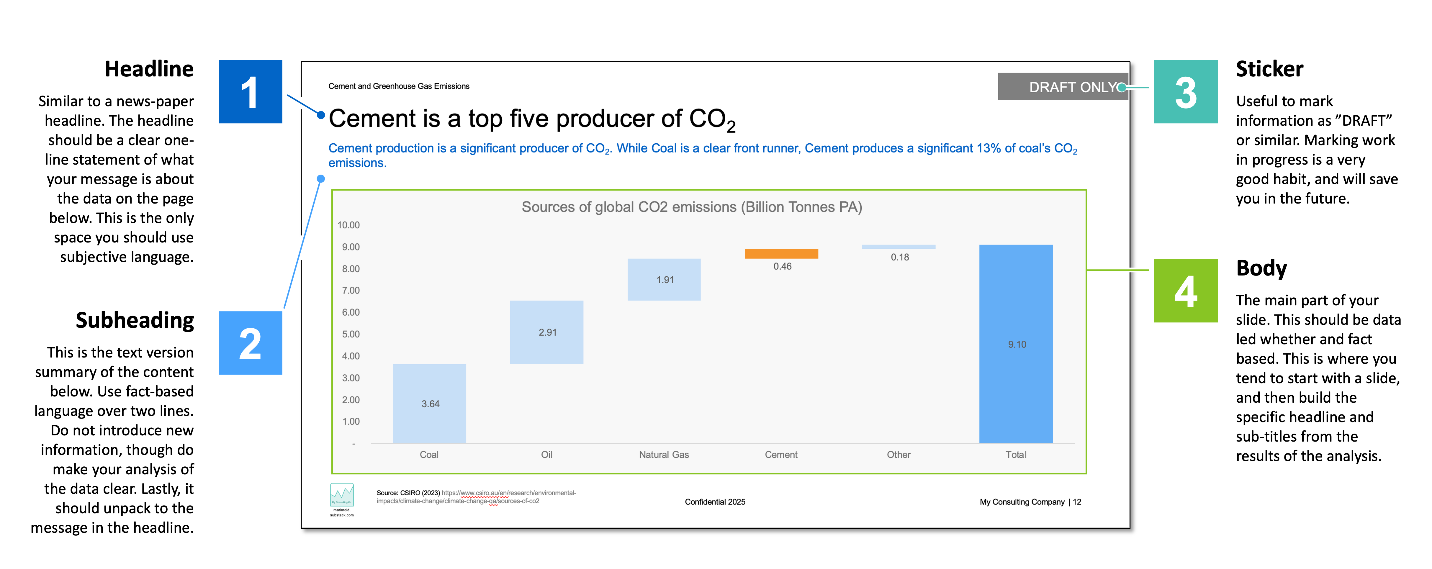
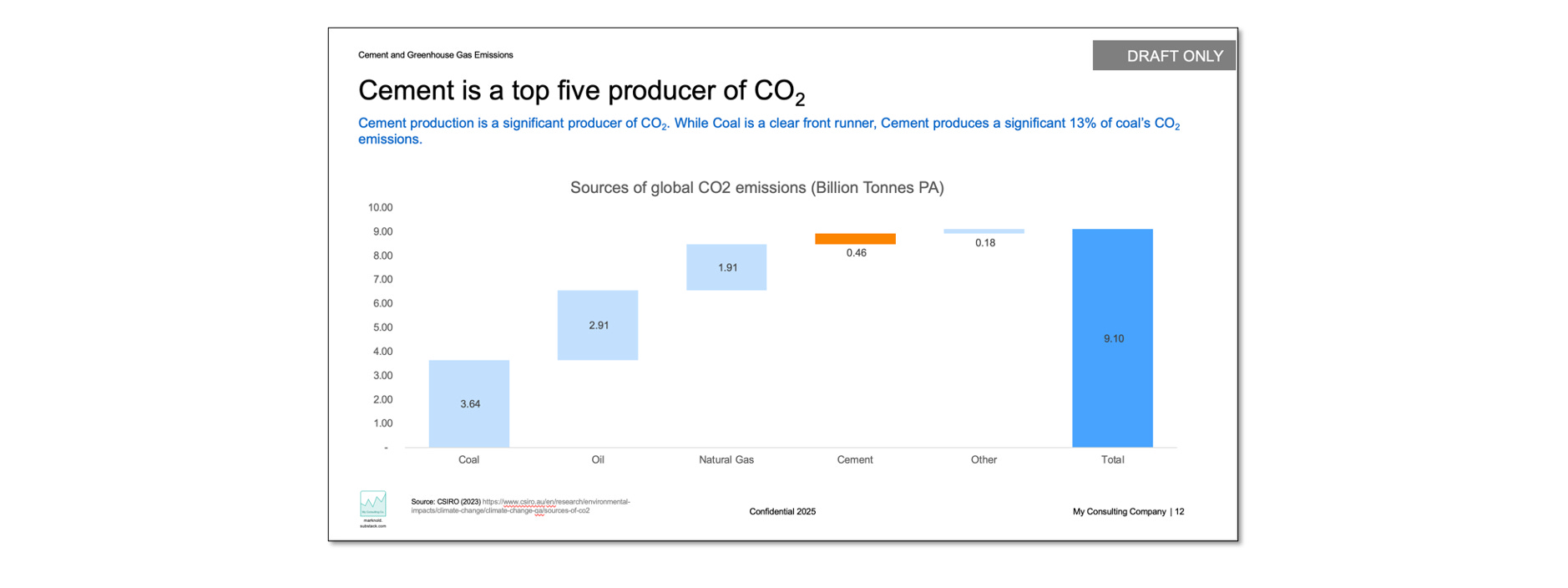
Headline
What is it? A sentence at the top of the page that summarizes the main takeaway or insight;
Why is it important? Like a headline in a newspaper it grabs attention, it tells people your key message and makes them curious to know more; and
What does good look like? One line. Should be the key message you want the viewer to remember and tell others. Should include data. Can use emotive language, but be careful.
Subheading
What is it? Sits below the Headline and summarises the content of the slide below;
Why is it important? Slides are often graphical or data driven. The subheading should clearly and quickly explain the point you are making with the data below; and
What does good look like? Two lines maximum. Summarises the data below and your conclusion(s). Does not add in new data. Does not include emotive language. The Subheading is the text based summary of your work.
3. Sticker
What is it? A little note on slides as a warning or direction for the reader;
Why is it important? This is more about protecting you and the firm. Until something is ready to release to the client call it “DRAFT”. It’s not 100% but it is a good habit; and
What does good look like? Just stick it on until everyone agrees “we are done”. Can use to assign who does what eg: “DRAFT MN” or “DRAFT LD”.
4. Body
What is it? This is the data or the detail of the content that you want to show;
Why is it important? Headlines are not enough. Show data or information to attempt to demonstrate your point; and
What does good look like? Use facts and data. Try focusing on one idea per page. Use “pictures” (charts, diagrams etc) that demonstrate one of the 6 Ws: What, Where, When, Who, How or Why. The detail shown should depend on what the audience needs, eg: The CFO may want detailed cost breakdowns, while others may want to see a summary of profit over time. This body is the graphical summary of your work.
Other features of a slide include:
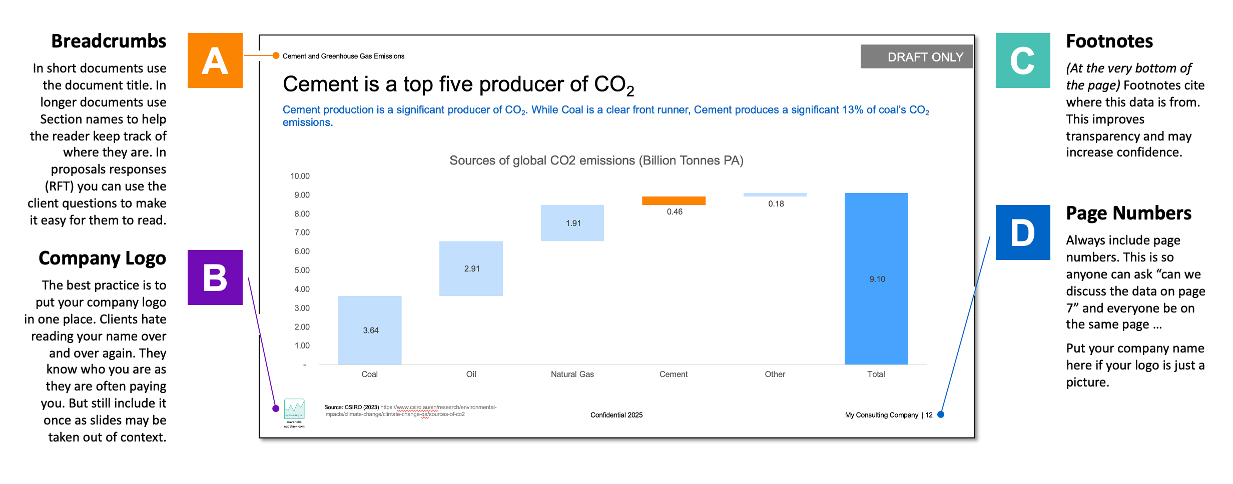
A. Breadcrumbs
What is it? This forms a map to track where you are in a document;
Why is it important? Reports can span 20, 50 or over 100 pages. More than 10 page and you should use breadcrumbs; and
What does good look like? Simple and consistent. Document Title should be the default. Use Section names for long reports. Use questions and question numbers for responses (eg: Grant Submissions, Applications, RFT responses) eg: “Q17.1 Please show and detail your Proposed Program Plan”
B. Company Logo
What is it? Your organisation’s logo. It should be a visual identifier;
Why is it important? The logo partly there to remind the reader who produced this report. It’s also partly there so if it’s sitting on your client CFO’s desk other people think “wow they must be awesome”. But it is mostly there if individual pages are separated out physically or digitally; and
What does good look like? Just the logo. Once only per page, and in the same place. Present but unobtrusive. Readers often know who you are, and paid a lot of money for their report. Overuse can be obnoxious.
C. Footnotes
What is it? Use for sources or citations. Can be used for qualifiers that must accompany the data;
Why is it important? Sources increase your transparency, and often increase the reader’s trust. “Where did you get the data?” and “How recent is it?” are common conversations points, so why not cut to the chase? and
What does good look like? Simple, clear and consistent. I use “Source Organisation Name (Date). Document Name or URL.”
D. Page Numbers
What is it? The current page number;
Why is it important? If a reader has a query in a meeting or after it is easy to say “I have a question about the data on page 7” rather than “I have some doubts about the data in the report”; and
What does good look like? I prefer just the page number, not page / page total (eg: 5/178).

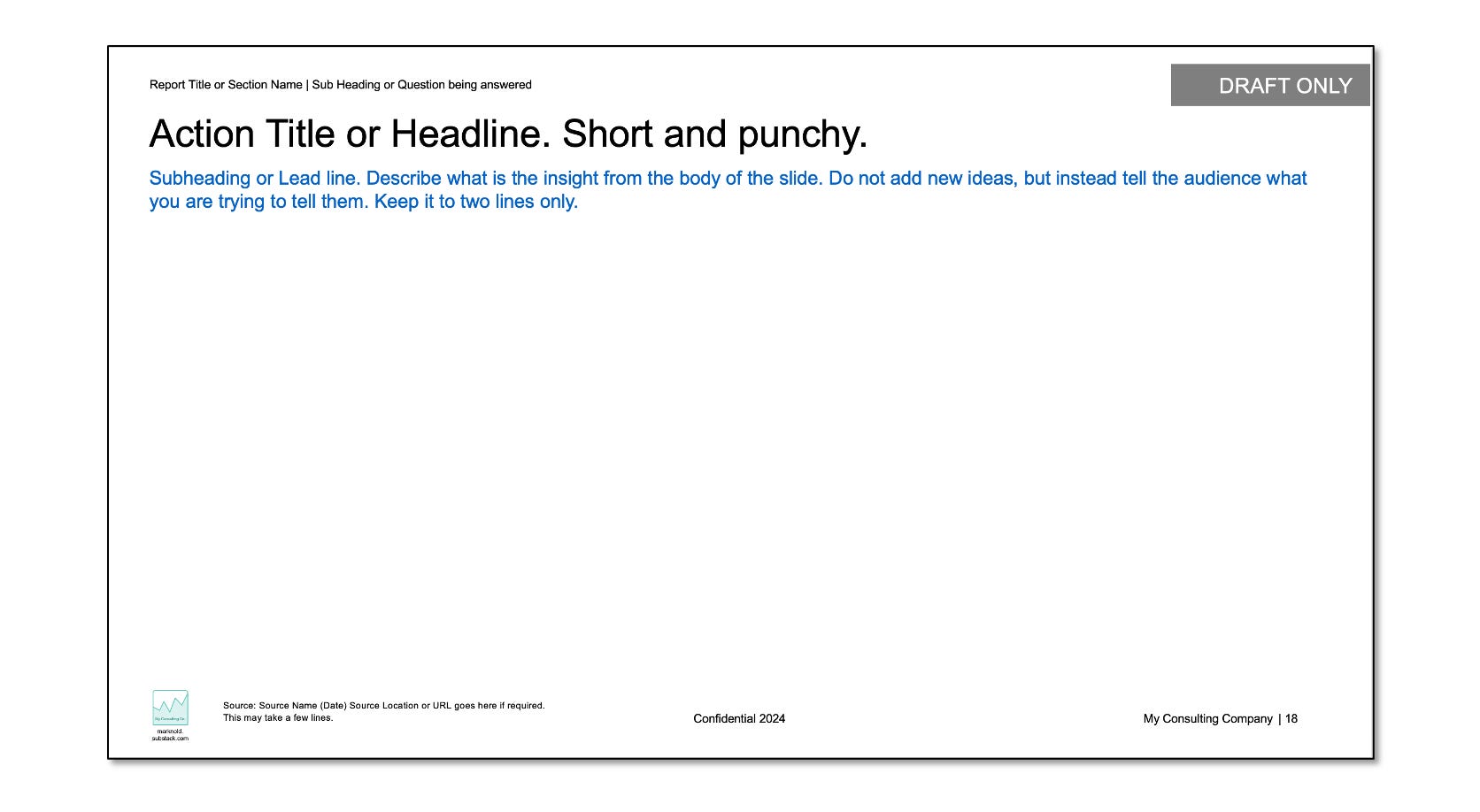
If you have all these in place you have what I call the Basic Slide. This is where you often start from. Keep a Basic Slide at hand plus a cover page and you are ready to do anything.
Future articles I’ll delve into how to make killer slides, plus after that: making killer decks.
Example slides like the above and a hundred more are available in my Free to use Business Template. My aim is to help new managers and consultants communicate better. Download, use it and have fun.